together, we are unshakable. Our roots run deep, connected by faith and strengthened by our shared devotion to a higher purpose. We stand as a collective, bound not by circumstance but by a powerful, unwavering truth: in unity, there is strength. This brand is built on the idea that we, as believers, are not meant to walk alone—we are a force, a community, moving forward with confidence, purpose, and resilience.
Our mission is simple yet profound: to harness the collective power of faith, where each individual contributes to something greater. We are more than just a brand; we are a movement of strong, driven souls who understand that strength is found in togetherness. Every piece we create embodies this edge, reflecting the boldness and confidence that comes with knowing you are part of a powerful, united whole.


At Vine & Branch, we are inspired by the idea that true power is born from unity. Together, we rise. Together, we push beyond the ordinary. Together, we build a future that is not defined by the world, but by the strength of our faith. We are branches intertwined, rooted in unshakable truth and driven by a shared mission—to stand firm, to live boldly, and to lead with unwavering confidence.
Our vision extends far beyond the clothing we create. We are here to inspire a new generation of believers who understand that their strength comes not only from within but from the community they stand with. This is a brand for the fearless, the bold, and the unbreakable. For those who know that when we unite, we move mountains. When we believe together, we become unstoppable.
With every step, Vine & Branch speaks to the heart of collective power, to the energy that flows through us when we stand as one. We are a force that grows stronger through every connection, every shared purpose, and every act of faith. In unity, we find our edge. In togetherness, we find our confidence. And in faith, we find our unshakable strength.
THE DETAILS


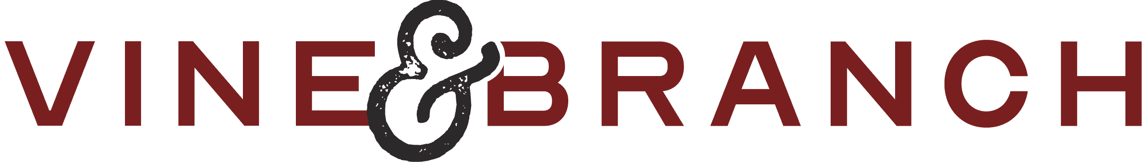
PRIMARY
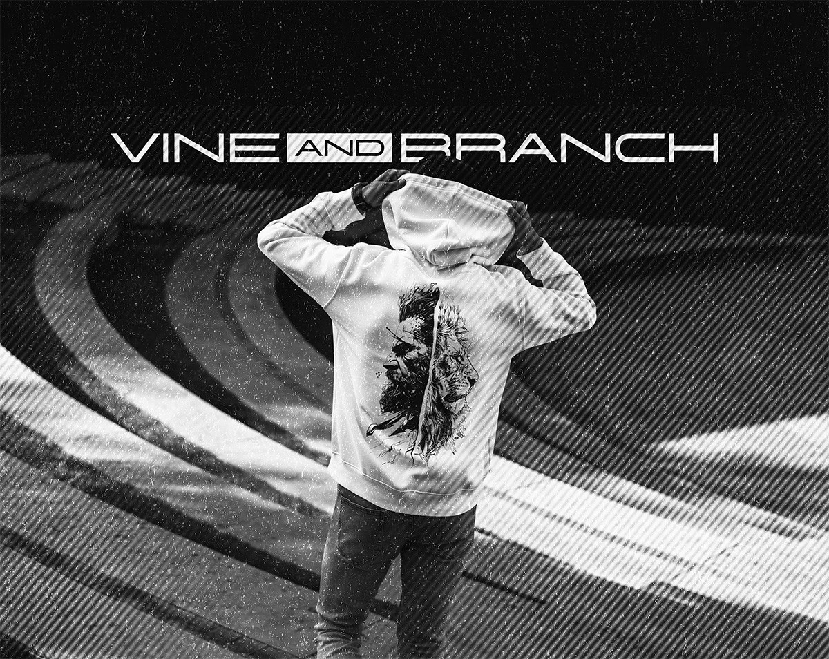
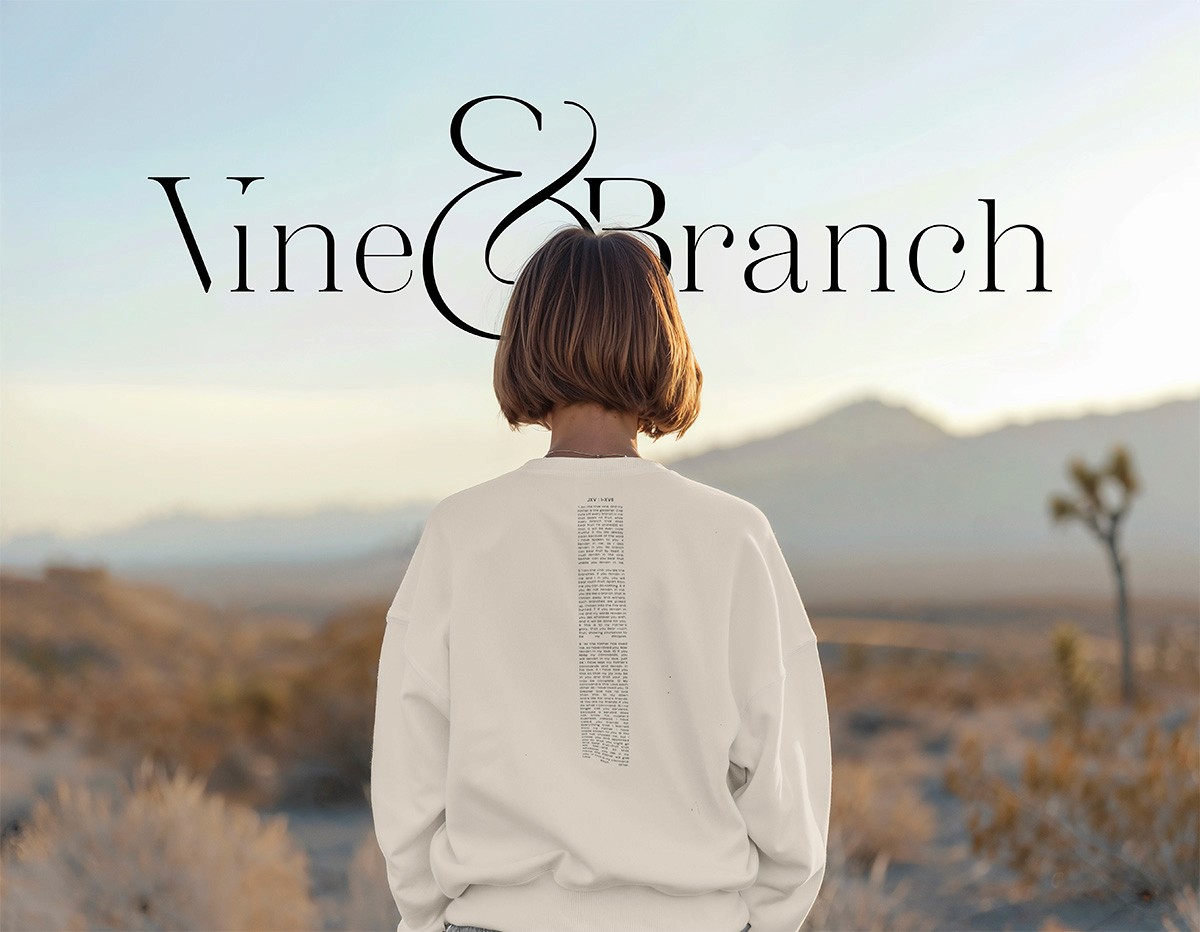
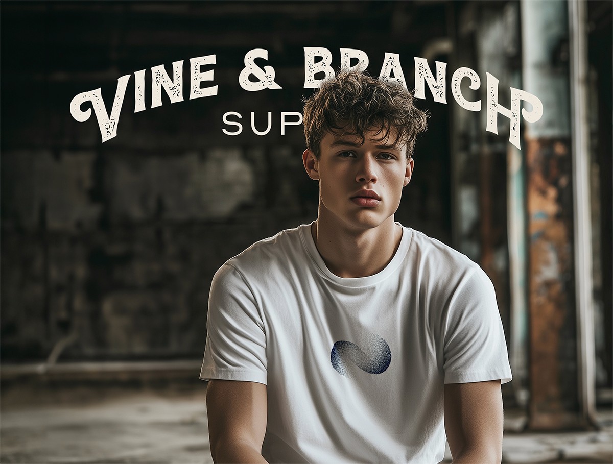
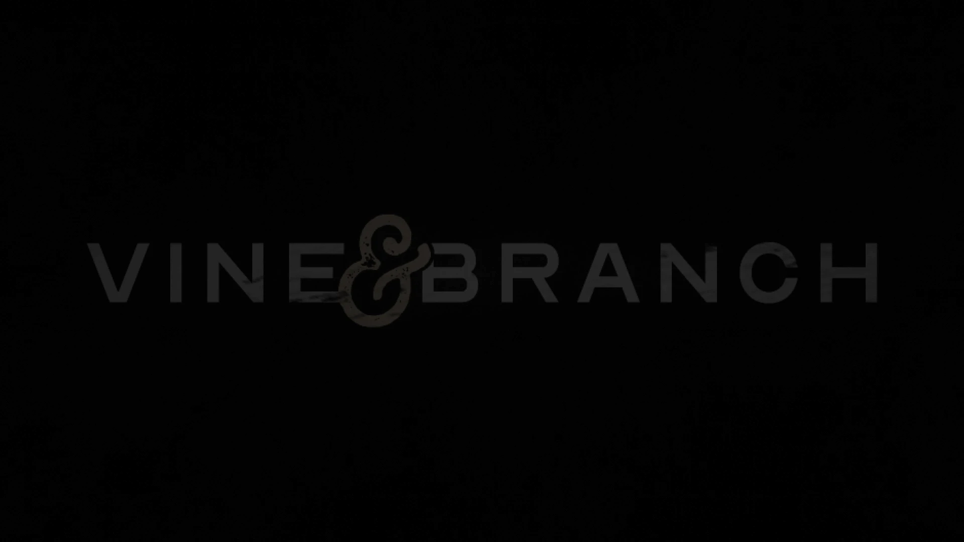
The logo set shown here has been designed to emphasize unity and value through the use of a rich serif typeface that is both emphasized and cut with the ampersand symbol connecting "Vine" and "Branch"
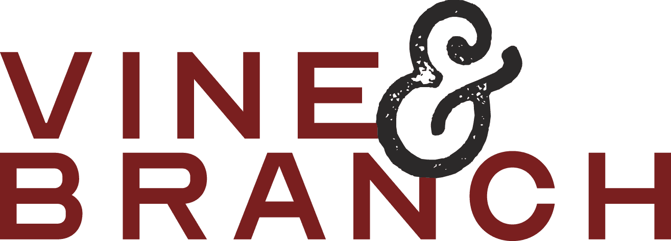
STACKED
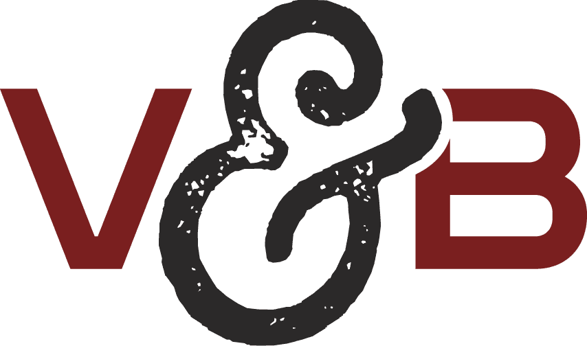
Simplifying the primary logo down to an acronym that still utilizes the same ratio in which it was built, the acronym logo allows for use in established applications and helps reduce redundancies as the brand expands across platforms and mediums.
ACRONYM
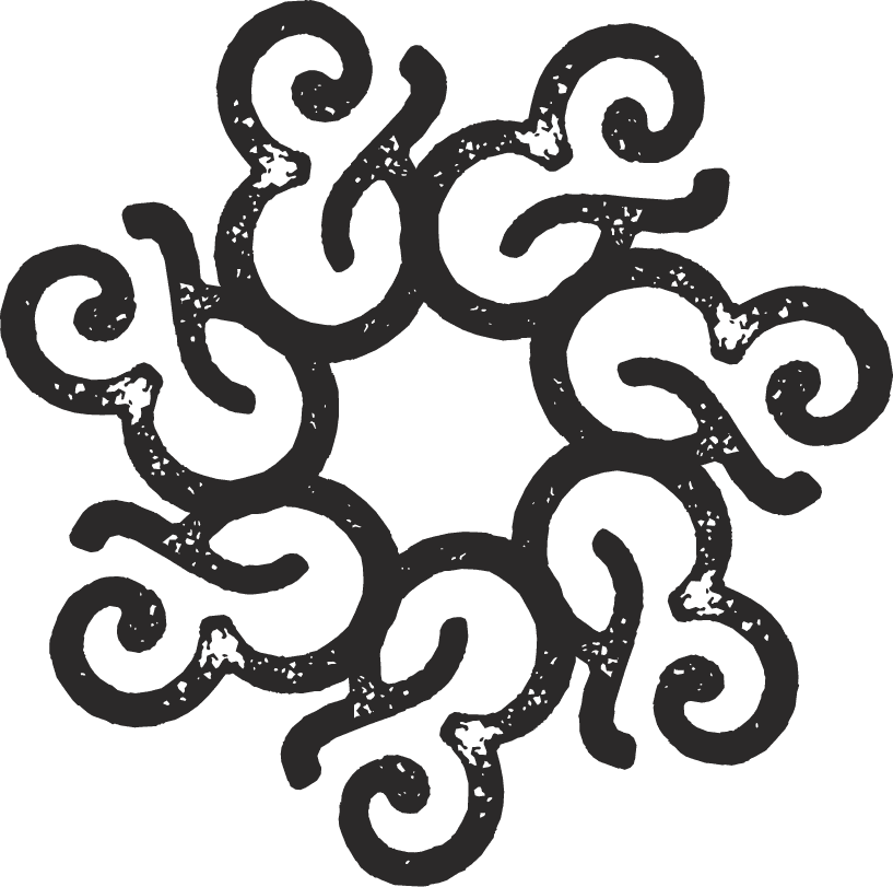
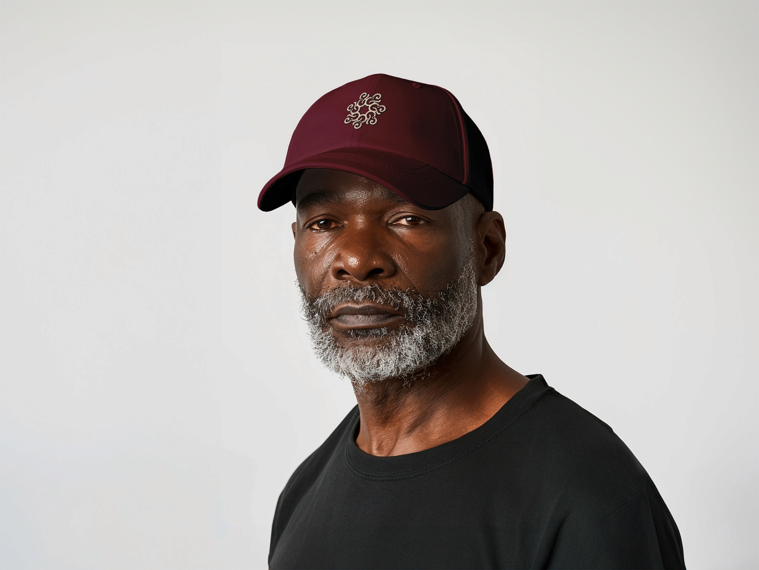
The mark logo strips the arm of the ampersand to create a unified structure of 7 abstract shapes that speaks to the connection between the brand and its community. The use of the mark is loose, providing it the flexibility to scale alongside the brand to provide a fresh look with each new application.
Mark
The mark logo strips the arm of the ampersand to create a unified structure of 7 abstract shapes that speaks to the connection between the brand and its community. The use of the mark is loose, providing it the flexibility to scale alongside the brand to provide a fresh look with each new application.


AURA
empowered
unified
fearless
resilient
unbreakable
At the heart of Vine & Branch is a spirit of unwavering strength and courage, drawn from a deep connection to faith and community. This brand is about standing firm in purpose, no matter the challenges, and embracing a sense of unity that fuels confidence and resilience. It’s a movement of bold individuals who find power in togetherness, living with determination and a fearless resolve to push forward. Through faith and shared purpose, we rise above, stronger and more capable of facing anything that comes our way.
TAG
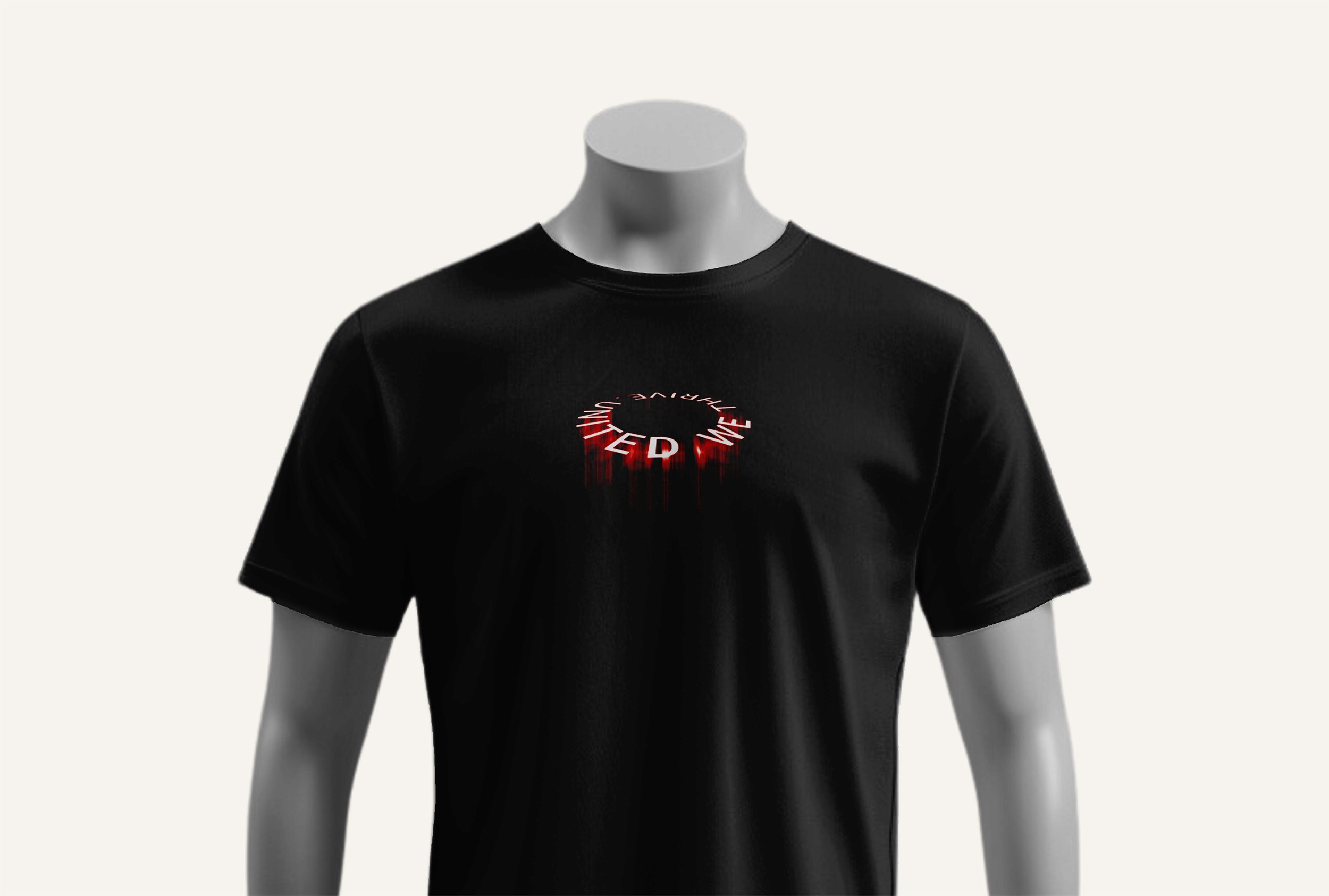
stand together.
Our mission is a a call to unity, strength, and shared purpose. It’s more than just a phrase; it’s an invitation to join in something greater. At the core of our brand is the belief that we are stronger when we stand side by side, bound by faith and the sacrifice of Christ. “Stand Together” reflects the idea that we are not alone in our journey, but connected as one body, forging ahead with confidence and resilience. In a world that often seeks to divide, this tagline serves as a bold reminder to rise in unity, empowered by the strength we find in each other and in our shared devotion to God.
MANTRA
one faith, one strength.
Our mantra is a powerful declaration of unity and shared purpose. It speaks to the heart of our brand’s mission: that through our faith, we are bound together, drawing strength from one another and from our collective belief in Christ. This mantra highlights the inseparable connection between faith and strength, emphasizing that as we stand united in our faith, we become an unbreakable force.
This is a call to action, inviting every individual to embrace the idea that we are part of something bigger—one faith that fuels our resilience, one strength that empowers us to rise together. It reflects the core belief that our unity in Christ gives us the power to overcome, to thrive, and to stand firm in a world that often seeks to divide. “One Faith, One Strength” is a reminder that in our shared faith, we find unshakable strength, creating a community where each person’s belief reinforces the strength of the whole.


In the Real World